
Vresh Foods
Vresh Foods
Vresh Foods, a Calgary-based ghee producer, wanted to grow their Canadian market but faced low online engagement and unclear barriers to purchase. My challenge was to uncover why shoppers weren’t engaging and design a solution that would build trust, educate, and make buying easier.
Vresh Foods, a Calgary-based ghee producer, wanted to grow their Canadian market but faced low online engagement and unclear barriers to purchase. My challenge was to uncover why shoppers weren’t engaging and design a solution that would build trust, educate, and make buying easier.
Client
Vresh foods
Timeline
Spring 2023
Tools
Figma, Miro, google forms
Figma & miro
Role
UX Strategy & Interface Design
UX/UI Design
The Challenge
The Challenge
Vresh Foods wanted to grow in Canada but weren’t sure why shoppers weren’t engaging with their ghee product. While they suspected low awareness was a factor, the real reasons for hesitation were unclear.
Vresh Foods wanted to grow in Canada but weren’t sure why shoppers weren’t engaging with their ghee product. While they suspected low awareness was a factor, the real reasons for hesitation were unclear.
The Challenge
Vresh Foods wanted to grow in Canada but weren’t sure why shoppers weren’t engaging with their ghee product. While they suspected low awareness was a factor, the real reasons for hesitation were unclear.
Research
Research
To uncover the barriers, I set out to understand Canadian shoppers’ awareness, perceptions, and buying behaviors around ghee. I conducted eight in-depth interviews with health-conscious consumers and surveyed 50 participants, focusing on their familiarity with ghee, perceived concerns, and what might encourage them to try it.
To uncover the barriers, I set out to understand Canadian shoppers’ awareness, perceptions, and buying behaviors around ghee. I conducted eight in-depth interviews with health-conscious consumers and surveyed 50 participants, focusing on their familiarity with ghee, perceived concerns, and what might encourage them to try it.
Research
To uncover the barriers, I set out to understand Canadian shoppers’ awareness, perceptions, and buying behaviors around ghee. I conducted eight in-depth interviews with health-conscious consumers and surveyed 50 participants, focusing on their familiarity with ghee, perceived concerns, and what might encourage them to try it.
Affinity mapping
Affinity mapping
To synthesize user feedback, I used affinity mapping in Miro. Each unique comment, pain point, and question was captured on sticky notes and grouped into themes.
To synthesize user feedback, I used affinity mapping in Miro. Each unique comment, pain point, and question was captured on sticky notes and grouped into themes.
Affinity mapping
To synthesize user feedback, I used affinity mapping in Miro. Each unique comment, pain point, and question was captured on sticky notes and grouped into themes.

Key themes identified
Trust issues: Many questioned the authenticity and quality of ghee products available in Canada.
Unclear usage: Shoppers were unsure how to use ghee in their daily cooking.
Purchase friction: Users found it difficult to locate and buy ghee, both online and in stores.
Key themes identified
Trust issues: Many questioned the authenticity and quality of ghee products available in Canada.
Unclear usage: Shoppers were unsure how to use ghee in their daily cooking.
Purchase friction: Users found it difficult to locate and buy ghee, both online and in stores.
Insights
These three themes became the foundation for my design strategy, guiding the new site structure and content priorities.
Insights
Insights
These three themes became the foundation for my design strategy, guiding the new site structure and content priorities.
These three themes became the foundation for my design strategy, guiding the new site structure and content priorities.
Key Themes IDentified
Trust issues: Many questioned the authenticity and quality of ghee products available in Canada.
Unclear usage: Shoppers were unsure how to use ghee in their daily cooking.
Purchase friction: Users found it difficult to locate and buy ghee, both online and in stores.
Personas
Personas
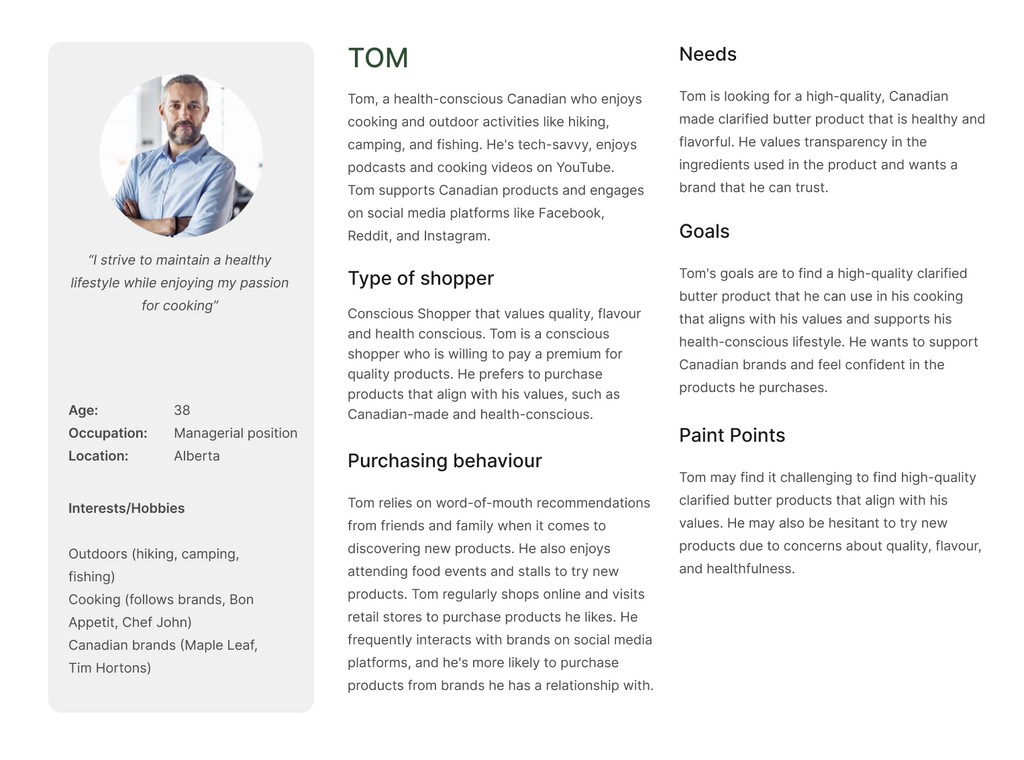
Based on my research, I developed two primary personas:
Tom: Health-conscious, values authenticity, needs sourcing info and practical usage tips.
Based on my research, I developed two primary personas to guide the solution:
Tom: Health-conscious, values authenticity, needs sourcing info and practical usage tips.
Personas
Based on my research, I developed two primary personas:
Tom: Health-conscious, values authenticity, needs sourcing info and practical usage tips.
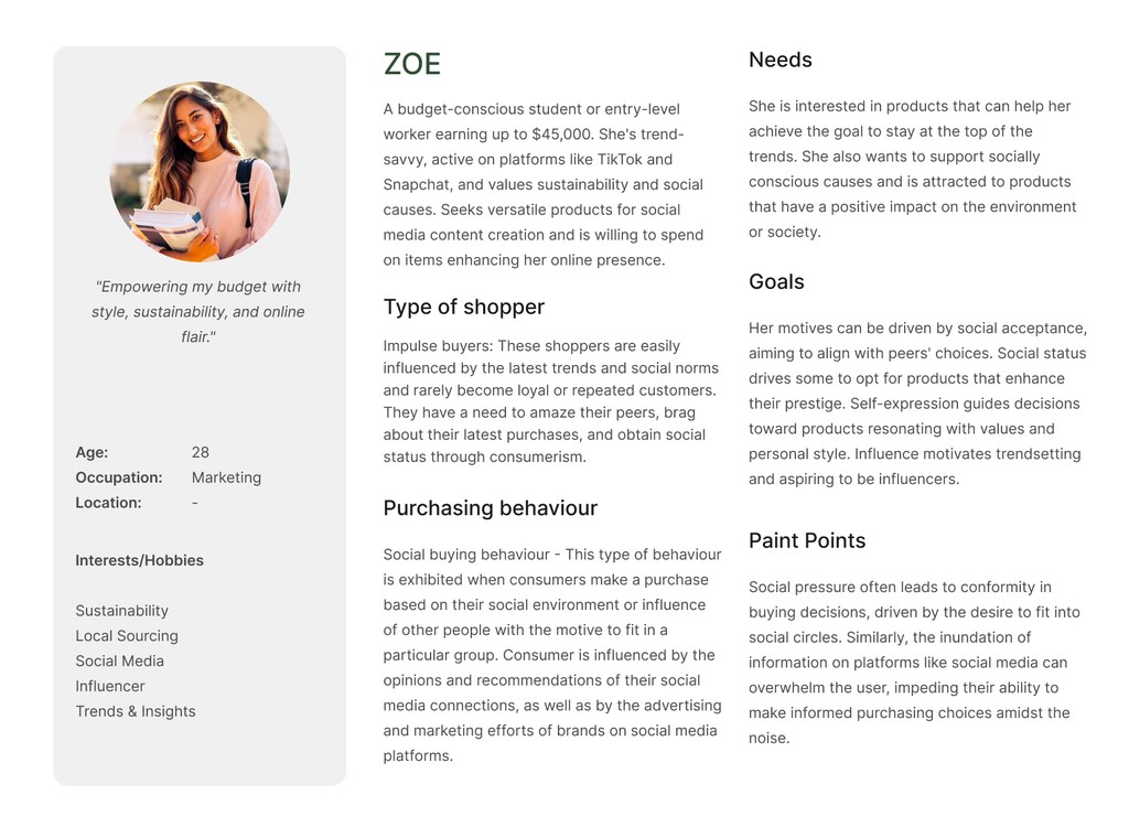
Zoe: Trend-driven, budget-conscious, seeks inspiration, social proof, and convenience.
Zoe: Trend-driven, budget-conscious, seeks inspiration, social proof, and convenience.
Zoe: Trend-driven, budget-conscious, seeks inspiration, social proof, and convenience.
User Journey
User Journey
Mapping the user journey revealed pain points at every step—from discovering ghee, to understanding its use, to finding where to buy. These insights informed the restructuring of navigation and content.
Mapping the user journey revealed pain points at every step—from discovering ghee, to understanding its use, to finding where to buy. These insights informed the restructuring of navigation and content.
User Journey
Mapping the user journey revealed pain points at every step—from discovering ghee, to understanding its use, to finding where to buy. These insights informed the restructuring of navigation and content.

Information architecture
Information architecture
Card Sorting & Prioritisation: I conducted an open card sorting exercise using Miro, where participants grouped content under Home, Our Process, Find Store, and Recipe Ideas. Each participant then used dots to vote for the items they felt were most important. For example, “Store Locator Map” and “How Ghee is Made” emerged as top priorities, while “Meet the Team” and “User-Submitted Recipes” received fewer votes. These results directly informed the prioritization and hierarchy in the final site map and homepage layout.
Card Sorting & Prioritisation: I conducted an open card sorting exercise using Miro, where participants grouped content under Home, Our Process, Find Store, and Recipe Ideas. Each participant then used dots to vote for the items they felt were most important. For example, “Store Locator Map” and “How Ghee is Made” emerged as top priorities, while “Meet the Team” and “User-Submitted Recipes” received fewer votes. These results directly informed the prioritization and hierarchy in the final site map and homepage layout.
Information architecture
Card Sorting & Prioritisation: I conducted an open card sorting exercise using Miro, where participants grouped content under Home, Our Process, Find Store, and Recipe Ideas. Each participant then used dots to vote for the items they felt were most important. For example, “Store Locator Map” and “How Ghee is Made” emerged as top priorities, while “Meet the Team” and “User-Submitted Recipes” received fewer votes. These results directly informed the prioritization and hierarchy in the final site map and homepage layout.


Site Map
Site Map
To address barriers around trust, education, and purchase friction, I restructured the site’s main navigation and content organization.
To address barriers around trust, education, and purchase friction, I restructured the site’s main navigation and content organization.
Site Map
To address barriers around trust, education, and purchase friction, I restructured the site’s main navigation and content organization.
Early Sketches
Early Sketches
I created sketches of the new site structure and a basic homepage layout to translate the new architecture into tangible ideas.
I created sketches of the new site structure and a basic homepage layout to translate the new architecture into tangible ideas.
Early Sketches
I created sketches of the new site structure and a basic homepage layout to translate the new architecture into tangible ideas.

Mockups & Prototypes
Mockups & Prototypes
I turned early sketches into high-fidelity mockups and interactive prototypes. Each design solves a key user problem.
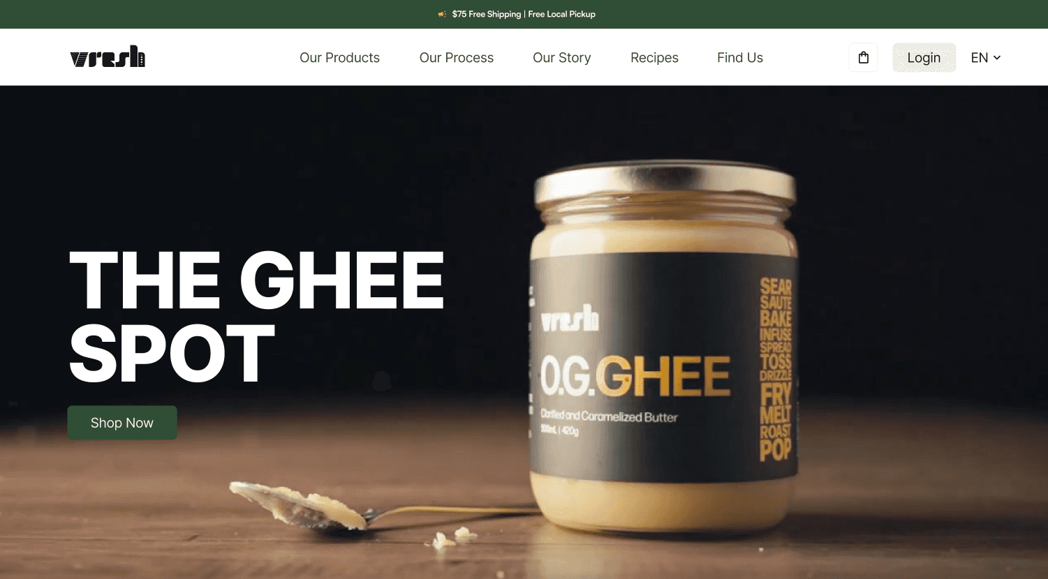
Homepage Redesign
The homepage now features a bold ghee video, clear nutritional facts, and user testimonials to build trust and credibility.

I turned early sketches into high-fidelity mockups and interactive prototypes. Each design solves a key user problem.
Homepage Redesign
The homepage now features a bold ghee video that shows off its look and appeal. Nutritional facts and user testimonials are front and center to build trust and credibility.
Mockups & Prototypes
I turned early sketches into high-fidelity mockups and interactive prototypes. Each design solves a key user problem.
Homepage Redesign
The homepage now features a bold ghee video, clear nutritional facts, and user testimonials to build trust and credibility.
Our Process Page
This new page explains how Vresh Ghee is made, highlighting local sourcing and brand values.
Our Process Page
This new page explains how Vresh Ghee is made. It highlights local sourcing and the brand’s values, helping users see the care that goes into every product.
Our Process Page
This new page explains how Vresh Ghee is made, highlighting local sourcing and brand values.

Interactive Recipe Page
This page suggests ghee-based recipes based on what users want to cook, inspiring them to try new things and see how ghee fits into their meals.
Interactive Recipe Page
This page suggests ghee-based recipes based on what users want to cook. It inspires users to try new things and helps them see how ghee fits into their meals.
Interactive Recipe Page
This page suggests ghee-based recipes based on what users want to cook, inspiring them to try new things and see how ghee fits into their meals.


Reflections
Working on Vresh Foods challenged me to look beyond surface assumptions and dig into the real reasons behind low engagement and purchase barriers. The combination of interviews, surveys, and affinity mapping revealed that trust, unclear usage, and purchase friction were far more significant than just low awareness—shifting both my perspective and the client’s.
Synthesizing research into actionable themes gave me a clear foundation for every design decision, from information architecture to content priorities. The open card sorting and dot voting exercises were especially valuable, as they ensured the new navigation and homepage truly reflected what users cared about most.
Iterative testing was a key learning point. Even small interface changes—like making recipe filters more visible and expanding their options—had a noticeable impact on user satisfaction. This reinforced the importance of not just adding features, but refining them based on real feedback.
Looking back, I see the value of a structured, evidence-based process.
Find In Store Page
The new store locator uses a map and location data to show where users can buy Vresh Ghee nearby, making shopping easier for those who prefer to buy in person.
Find In Store Page
The new store locator uses a map and location data to show where users can buy Vresh Ghee nearby. This makes shopping easier for those who prefer to buy in person.
Find In Store Page
The new store locator uses a map and location data to show where users can buy Vresh Ghee nearby, making shopping easier for those who prefer to buy in person.
Usability Testing & Iteration
I tested the redesigned site with target users, asking them to find recipes and locate stores. While users liked the homepage video and testimonials, many missed the recipe filters or wanted more filtering options. They specifically requested ways to sort recipes by meal, ghee flavour, diet, and cuisine.
In response, I made the filter bar more prominent and expanded the filter categories. In follow-up sessions, users found it much easier to discover relevant recipes, and overall satisfaction improved.

Product Page Update
The product page is now simpler and easier to use. Clear icons and a clean layout help users pick products and add them to their cart in one place. Nutritional info is easy to find, building trust.
Product Page Update
The product page is now simpler and easier to use. Clear icons and a clean layout help users pick products and add them to their cart in one place. Nutritional info is easy to find, building trust.
Product Page Update
The product page is now simpler and easier to use. Clear icons and a clean layout help users pick products and add them to their cart in one place. Nutritional info is easy to find, building trust.

Usability Testing
Usability Testing
I tested the redesigned site with target users, asking them to find recipes and locate stores. While users liked the homepage video and testimonials, many missed the recipe filters or wanted more filtering options. They specifically requested ways to sort recipes by meal, ghee flavour, diet, and cuisine.
In response, I made the filter bar more prominent and expanded the filter categories. In follow-up sessions, users found it much easier to discover relevant recipes, and overall satisfaction improved.
I tested the prototypes with users. They liked the homepage video and recipe ideas. Some wanted more ilters on the recipe page and an easier store locator.
I didn’t have time to make these changes, but I know iteration is important. Next, I’d refine these features and test again to improve the experience.
I tested the redesigned site with target users, asking them to find recipes and locate stores. While users liked the homepage video and testimonials, many missed the recipe filters or wanted more filtering options. They specifically requested ways to sort recipes by meal, ghee flavour, diet, and cuisine.
In response, I made the filter bar more prominent and expanded the filter categories. In follow-up sessions, users found it much easier to discover relevant recipes, and overall satisfaction improved.
Reflections
Reflections
Working on Vresh Foods challenged me to look beyond surface assumptions and dig into the real reasons behind low engagement and purchase barriers. The combination of interviews, surveys, and affinity mapping revealed that trust, unclear usage, and purchase friction were far more significant than just low awareness—shifting both my perspective and the client’s.
Synthesizing research into actionable themes gave me a clear foundation for every design decision, from information architecture to content priorities. The open card sorting and dot voting exercises were especially valuable, as they ensured the new navigation and homepage truly reflected what users cared about most.
Iterative testing was a key learning point. Even small interface changes—like making recipe filters more visible and expanding their options—had a noticeable impact on user satisfaction. This reinforced the importance of not just adding features, but refining them based on real feedback.
Looking back, I see the value of a structured, evidence-based process.
More Works More Works
More Works More Works

©2025 Shakilo
Go Back To Top
©2025 Shakilo
Go Back To Top